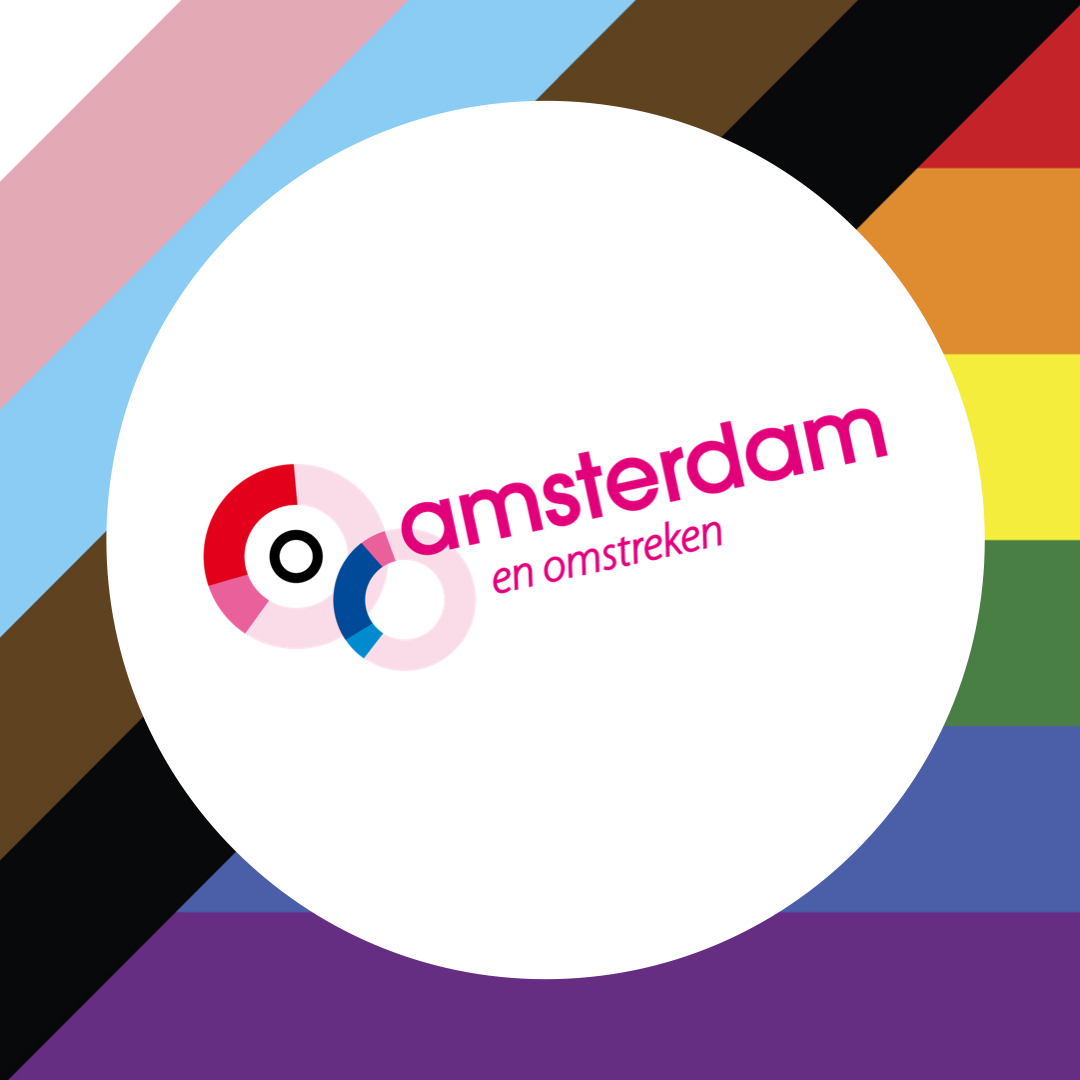
30 Jun Why COC Amsterdam e.o. is using the New Pride Flag
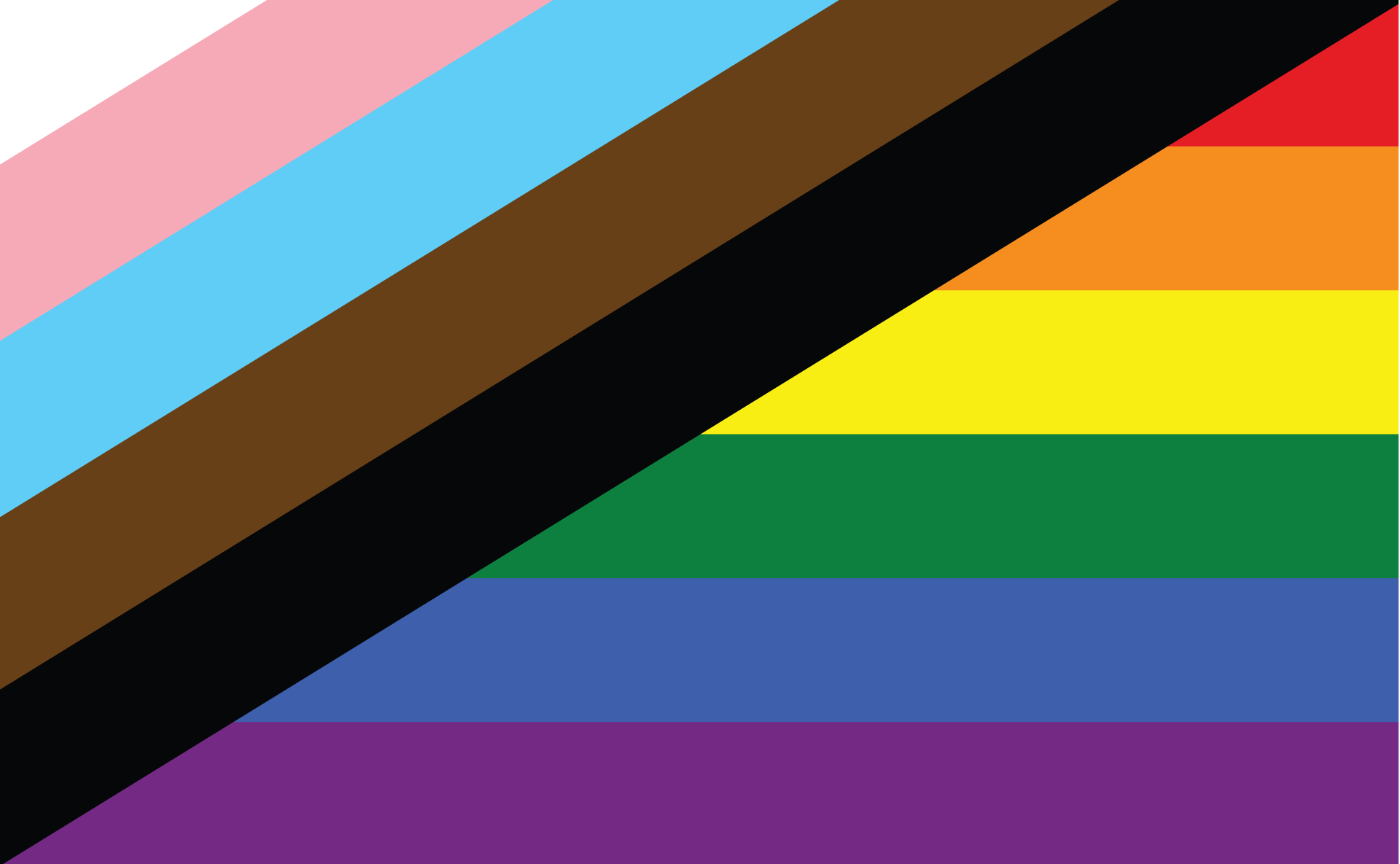
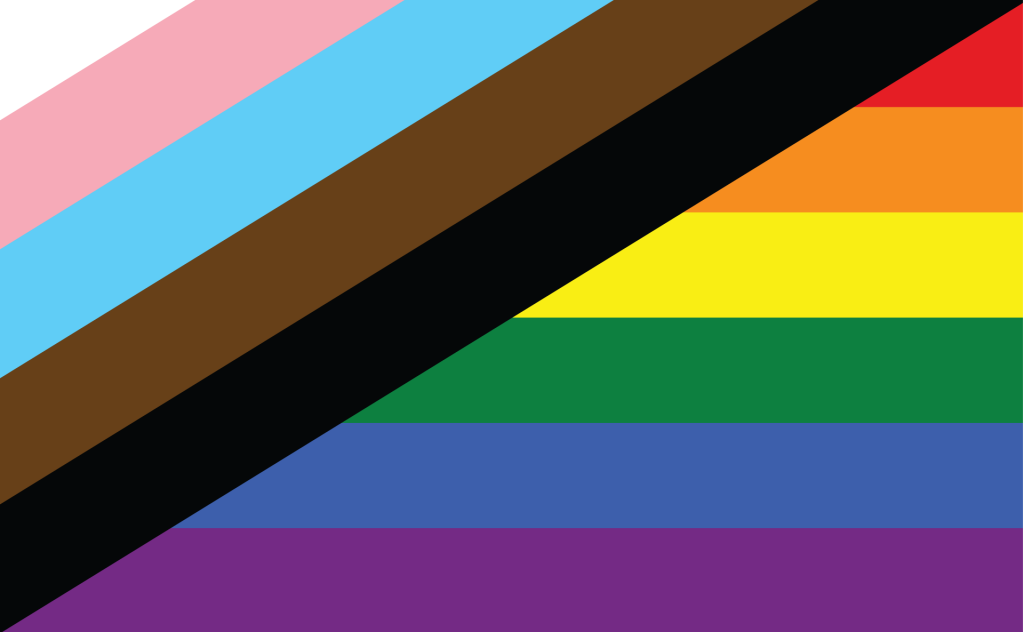
COC Amsterdam e.o. recently started using the new TQ PoC Pride flag, which centers Trans and Queer Black, Brown, and Indigenous people. “The fact that people are confronted with discrimination because of the color of their skin, origin or gender is the reason for COC Amsterdam e.o. to include this flag in the logo”, let COC Amsterdam e.o. us know.
The flag is designed by Julia Feliz, a gendervague, pansexual, Black and Native Puerto Rican, with the approach of providing a unique yet powerful statement of what Trans and Queer (TQ) People of Color (PoC) need from the LGBTIQ+ movement. Feliz explains that “the ‘TQ PoC New Pride Flag’ features the Trans flag intersecting the original Rainbow flag while centring Black and Brown People of Color, in honour, memory, and acknowledgement that we must center people in the most vulnerable positions, to achieve liberation for all. “
Next to this, it is also a bridge to the history of the movement and to key figures like Marsha P. Johnson, Sylvia Rivera, Miss Major, and Victoria Cruz – Trans Black and Brown Women/People of Color – who led the way for Pride/the modern LGBTQIA+ movement and are currently, the most targeted by homophobia and transphobia.
The flag is also designed to create awareness and raise money to support Black en Brown trans marginalised genders. COC Amsterdam e.o. has therefore specifically chosen for this non-commercial flag.
If we as a community want to support each other, then we should put the most marginalised groups first, take a step back and understand why we do this. It means that we are more than just allies. Read more about the meaning behind the flag at newprideflag.com or download the flag HERE.
Graphic Designer: Hayley Brown